Plan quilt colors so the patchwork stays easy to read
Build a practical fabric palette with light-dark contrast, a small layout test and a clear placement key before sewing.
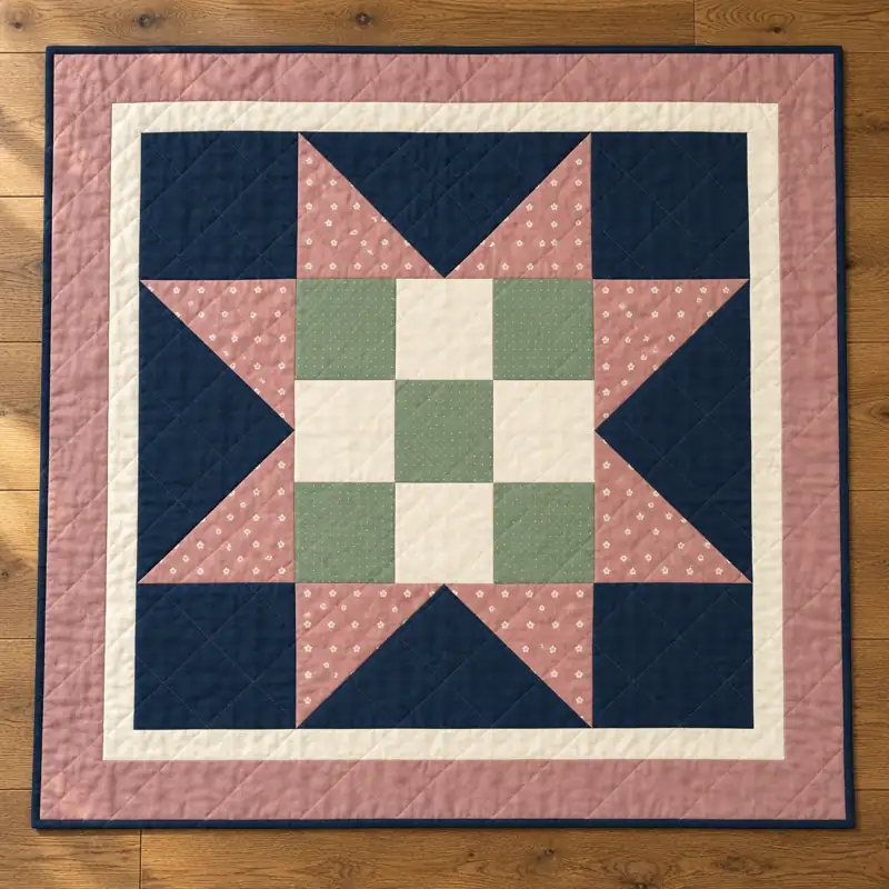
Choose the part you want people to notice
Begin with the design structure. A star needs its points to separate from the background; a strip quilt may depend on repeated light bands; a simple patchwork grid may use alternating values. Choose one main feature rather than asking every fabric to be the focal point.
Color names alone do not tell you how much contrast two fabrics have. A dusty pink and a pale sage can be different colors but close in lightness. If they meet at a small star point, the seam may become difficult to read from across a room.
Give each fabric a job
Make three small groups: background, main motif and accent. Put the quietest fabric where you want visual breathing room. Use the stronger contrast around shapes that need a clear outline. An accent can be a small area repeated through the layout; it does not need to occupy an equal share of the quilt.
Place real fabric samples beside each other in daylight and under the light where the finished piece will be used. A screen is useful for planning but cannot guarantee the color of purchased cloth. Printed florals can look lighter at a distance than their darkest individual flower.
Test light and dark separately from hue
Arrange the samples and take a simple photo for your own planning. View a grayscale version to see whether neighboring pieces remain distinct when hue is removed. This is a diagnostic aid, not a rule that every adjacent piece must have maximum contrast.
If a key shape disappears, change one of its neighbors or move a quieter fabric into that position. Keep subtle transitions when they are intentional, but do not depend on a tiny color difference to define a small construction detail.
Try a miniature layout
Draw a simple grid or print a small construction diagram from the pattern. Mark each fabric with a letter and color in the shapes, or place paper swatches over the diagram. For repeated blocks, lay out more than one block so you can see the secondary pattern formed between them.
In a star quilt, check both the points and the center. In a strip quilt, compare a whole column with the neighboring sashing. For a table runner, view the layout from both long sides; a directional novelty print may appear upside down from one seat.
Check scale before buying everything
A large flower may look wonderful on the bolt but become an unrecognizable fragment in a small square. Use a paper window the size of the visible finished patch to preview the motif. Include seam allowances when planning the actual cut, but use the finished area to judge what the viewer will see.
When substituting fabric, preserve the pattern roles before chasing an exact shade. A slightly different blue can work well if it has the needed contrast and scale. Matching a promotional image exactly is less useful than choosing a readable layout you enjoy.
Save a placement key
Label your chosen fabrics and photograph the final layout before stacking the pieces. Number rows and mark the top edge of directional units. Keep those notes beside the cutting list. If you change a fabric halfway through, update the key before sewing the next batch.
Our gallery images are styling concepts rather than proof of a sewn sample. Use the actual construction diagram to plan piece placement, and make a small test unit when a fabric combination is difficult to judge.